July 11, 2022Ad PlatformImprovement
This week, Topsort has updated our marketplace UI to improve your user experience. We’ve added a new way to view how many members are dedicated to a vendor account on Topsort. We’ve also moved “Ad Reviews” next to “Configurations” so that marketplace representatives can manage every setting related to banner ads all in one place.
Improvements
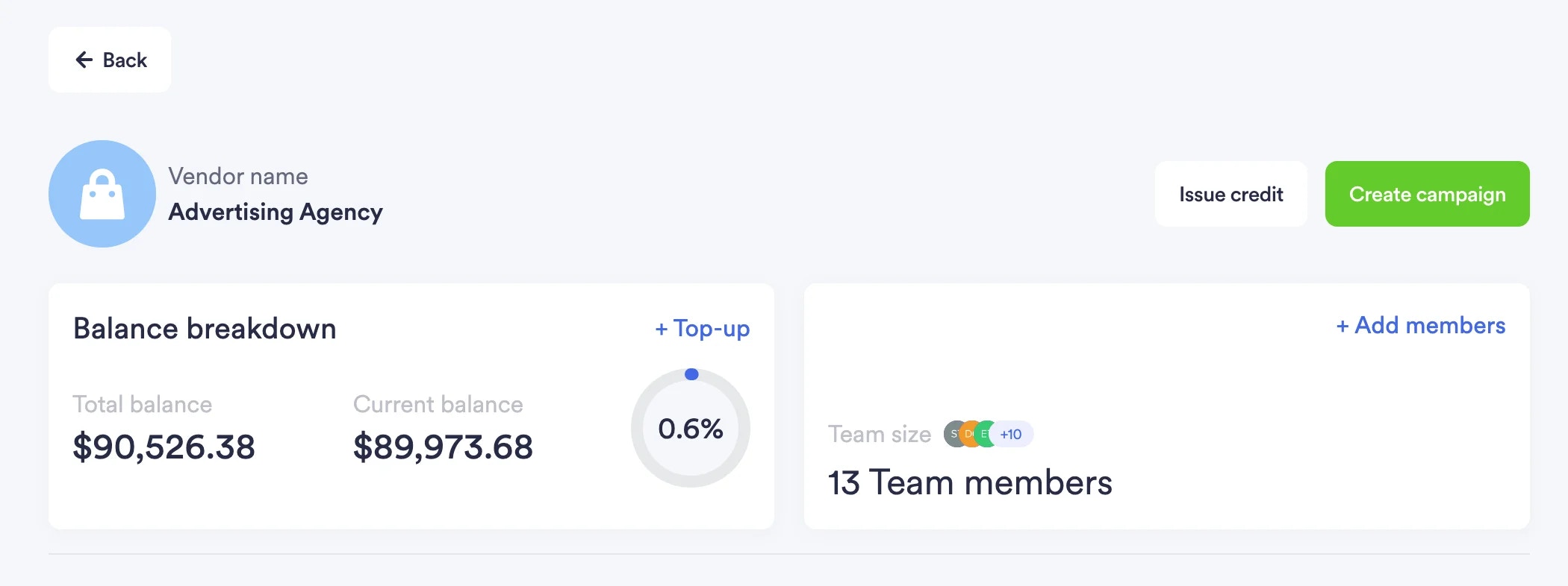
Added members card to vendor’s page
The newly added members card is located next to the “Balance Breakdown.” It clearly displays how many members have joined the Topsort platform in a space efficient way. Users can also choose to add members to the platform on this card.
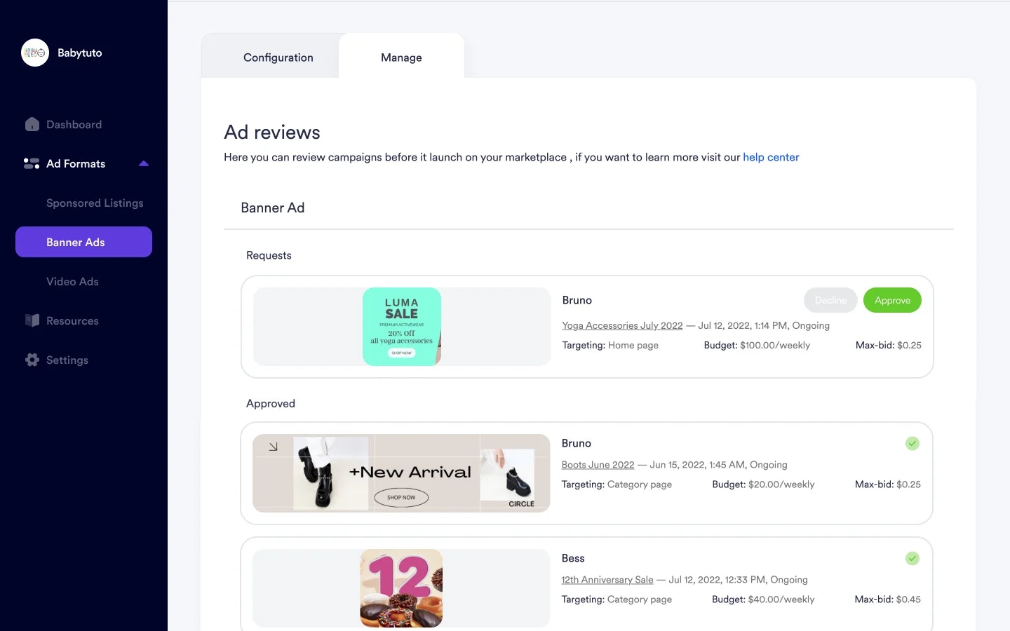
New “Manage” tab for reviewing banner ad creatives
Reviews for banner ad creatives are now located next to the configuration tab for banners. Formerly, it was labeled “Ad Reviews” and existed as a separate section on Topsort’s sidebar. By grouping “Ad Reviews” with “Configurations,” users can easily navigate between managing configuration settings and creative approvals.